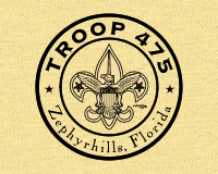
Ink Color & Garment Color Interaction
The ink colors and garment colors are shown by themselves. If you are choosing a stock design and choose from our recommended colors, you should not need to worry about ink color & garment color interaction.
If you are picking your own colors, be aware of how different colors look when they are next to each other. Their are a few main areas to consider.


Contrast
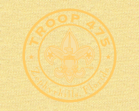
If you would like your design to be readable from a long distance, choose a light shirt color and a dark ink color. If you select an ink and shirt color that are very similar, you will not be able to see the design at long distances. Low contrast designs are popular and some of our stock designs include low contrast options. High Contrast – – – – – – – – – – – – – – – – – – – – – Low Contrast

Saturation
Some colors do not go well together. They are too close in saturation and, when touching, create visually disturbing effects. Shifting to a darker shirt or ink color generally fixes this problem. Too Close Saturation – – – – – – – – – – – – – – Adjusted Colors

Opacity
Inks are not 100% solid. Any ink color will allow some of the shirt color to show through. In some cases, you may choose particular colors and, because of the ink being less than 100% solid, the ink and garment mix to a different color. Cyan Ink on Yellow Haze Shirts: